Overview
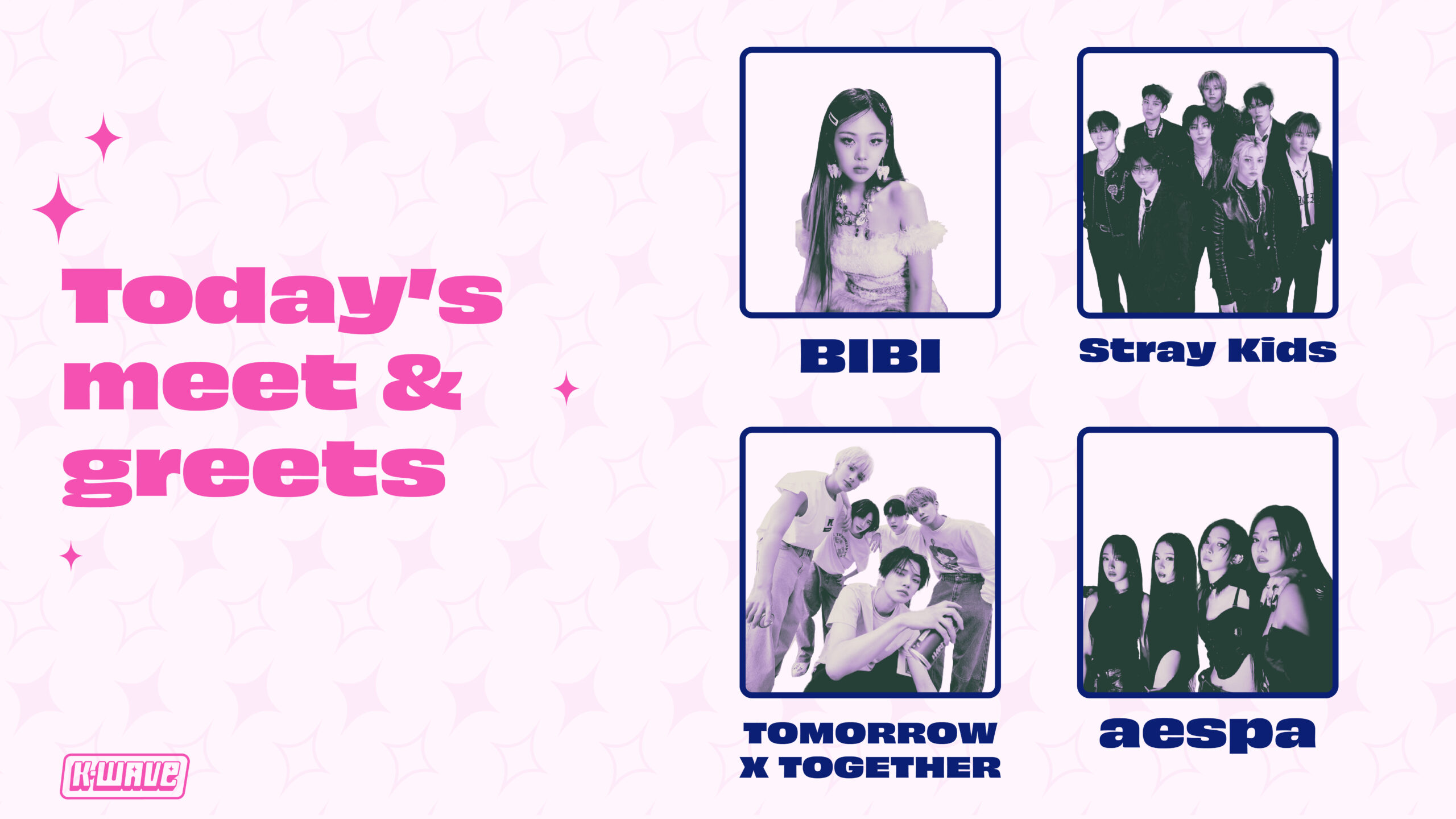
K-WAVE is a three day K-pop convention at the United Center in Chicago, Illinois. This convention gives fans performances from their favorite groups and artists as well as meet and greets. This also gives them the opportunity to find other artists and potentially find new music to listen to. K-WAVE values community and spreading joy through music. They believe the already strong community made by K-pop fans can bring them more opportunities to connect with others who love the same artists and a chance to see the artists themselves.
Justifications
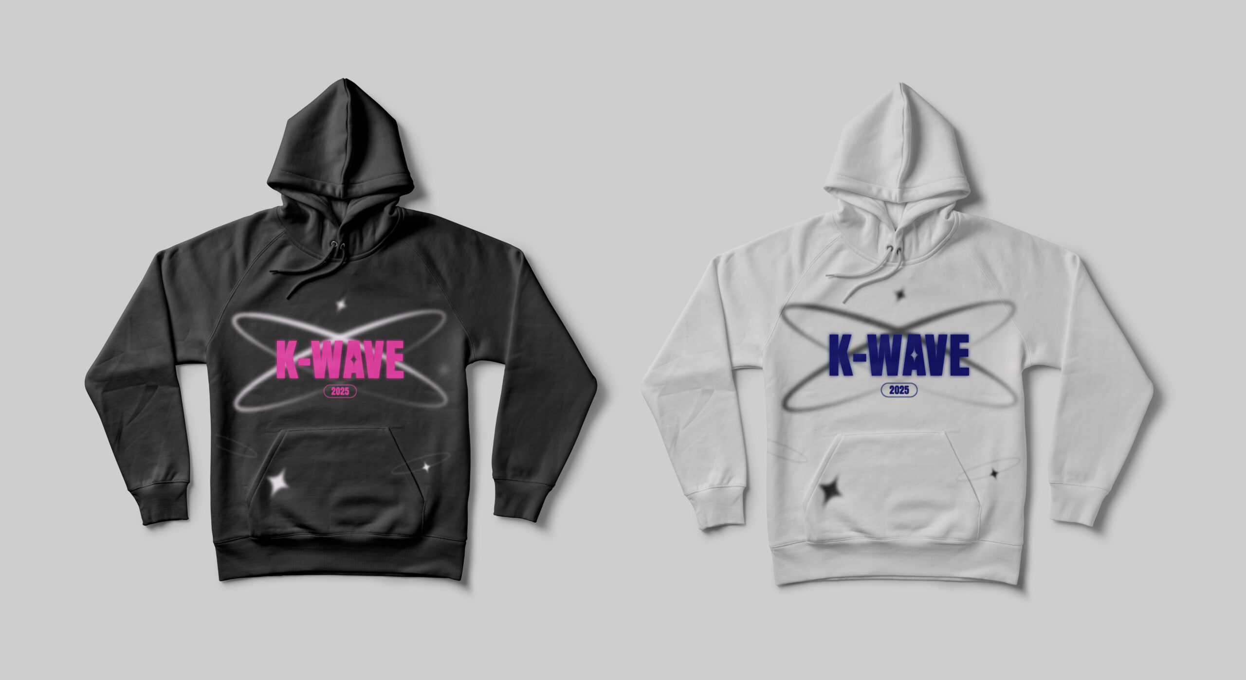
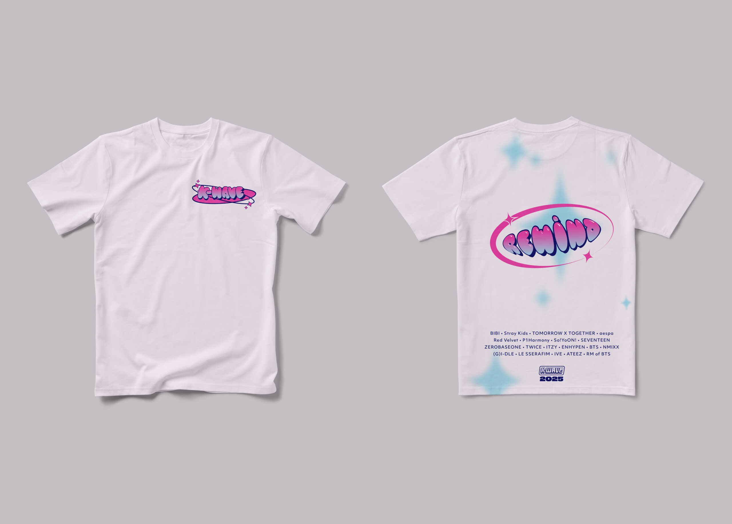
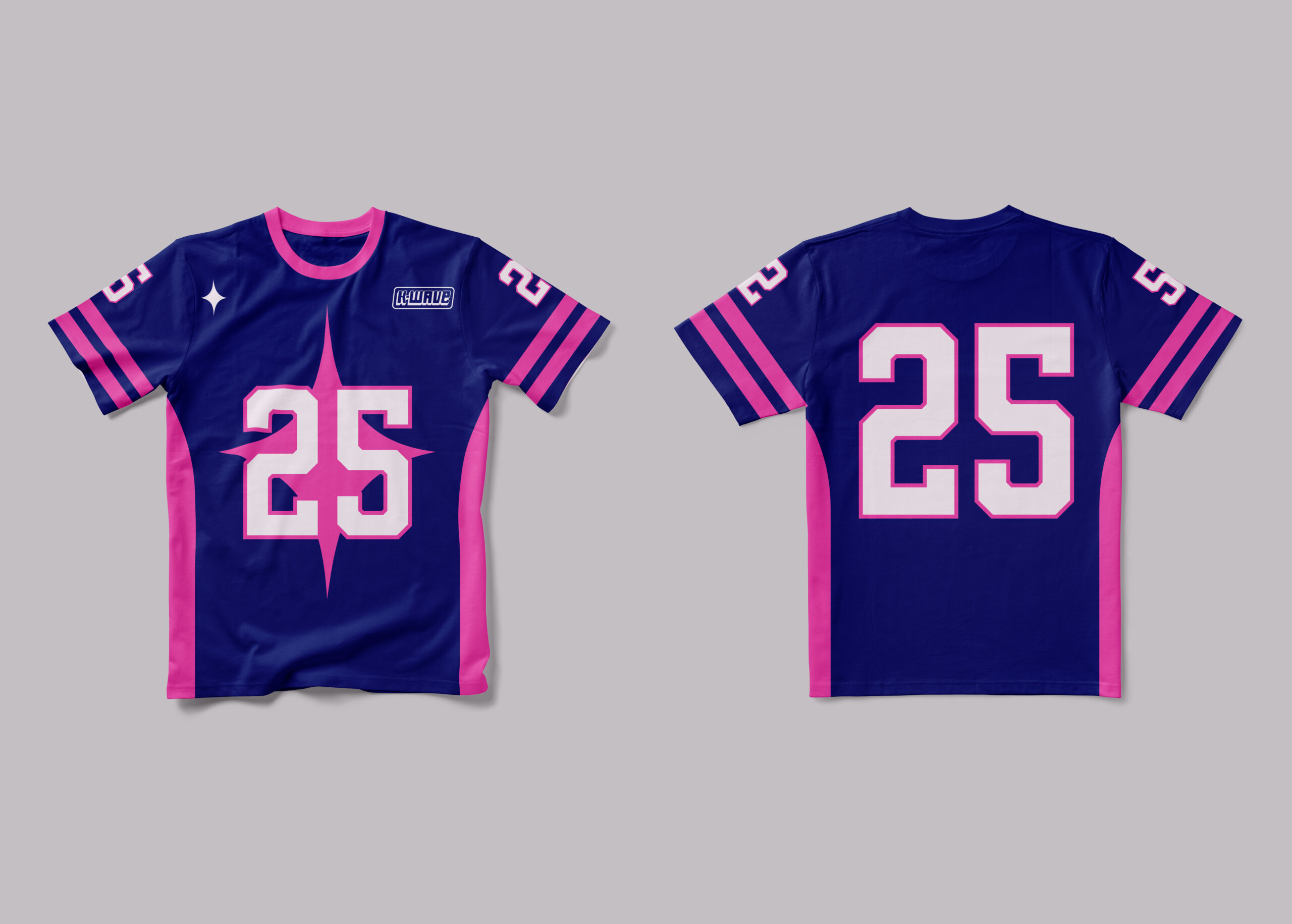
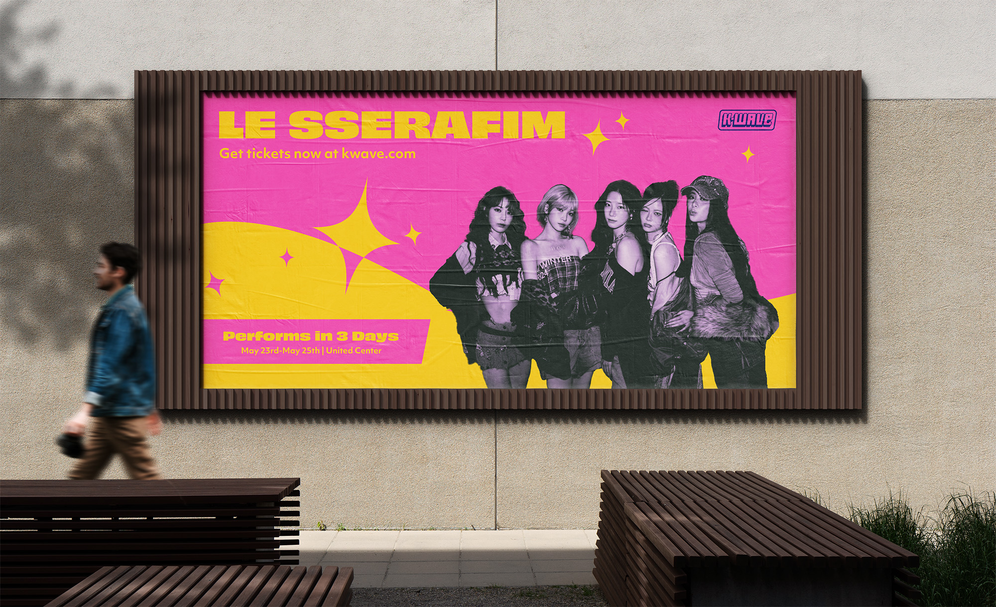
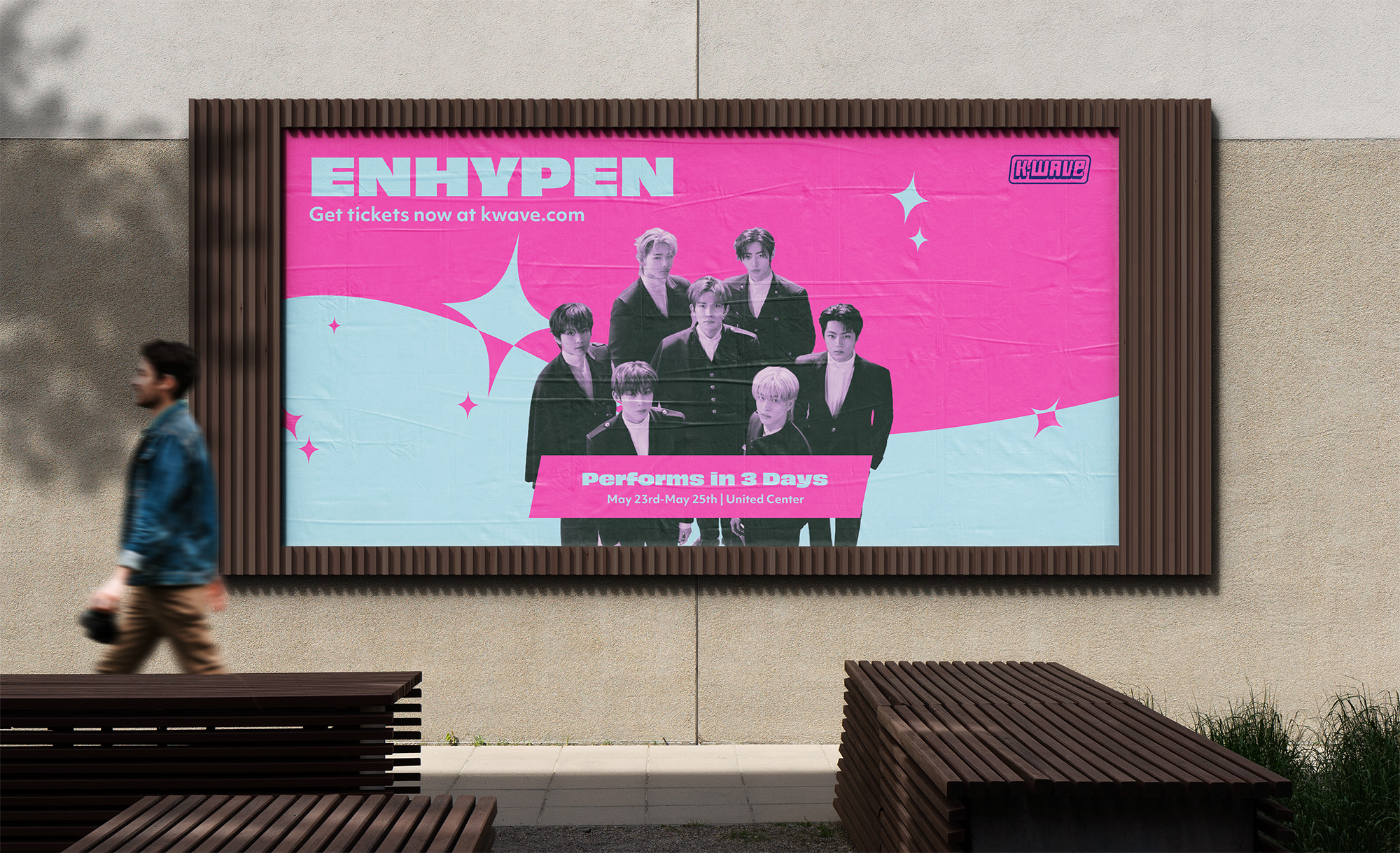
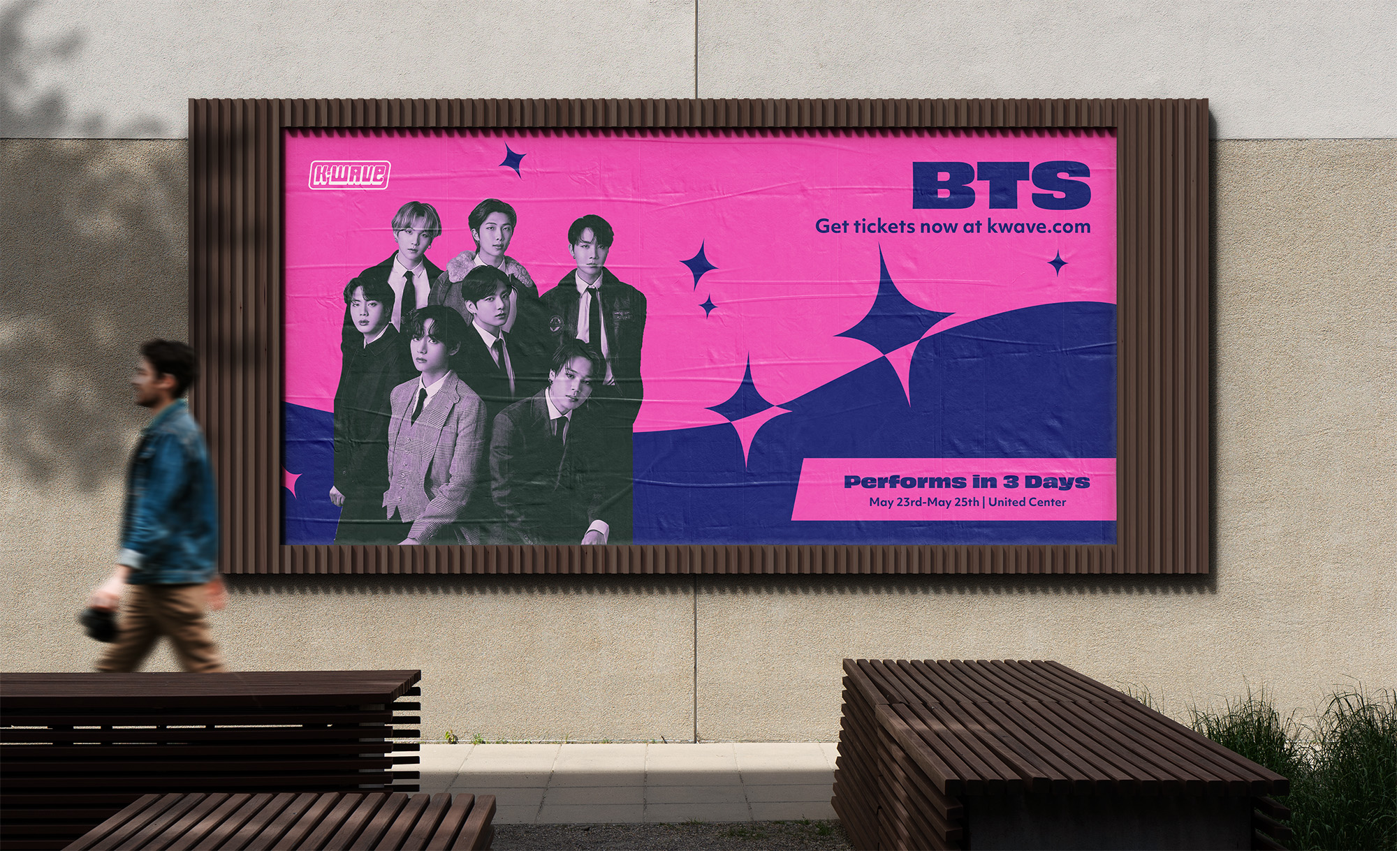
The tone for this project is to capture the fun and exciting energy that K-pop has from the fans dressing up like they’re the ones going on stage to the designs of the brand. The theme follows the Y2K trend that’s popular for the music genre at the moment while still staying bold and eye-catching. They follow popular trends and are going for a loud, passionate, and bright atmosphere. For this project, I wanted to keep it vibrant and showcase the fun side of being a part of the K-pop community. For the logo, I went with a bold typeface that fits the Y2K theme and colors to compliment that. They are bright and contrast the Y2K vibe since some groups have more playful group concepts. For the way images are treated, I wanted them to stand out and not get outshined by the rest of the branding, so I decided to give them a darker gradient map that contrasts the bright colors of the rest of the brand.
Environmental Signs
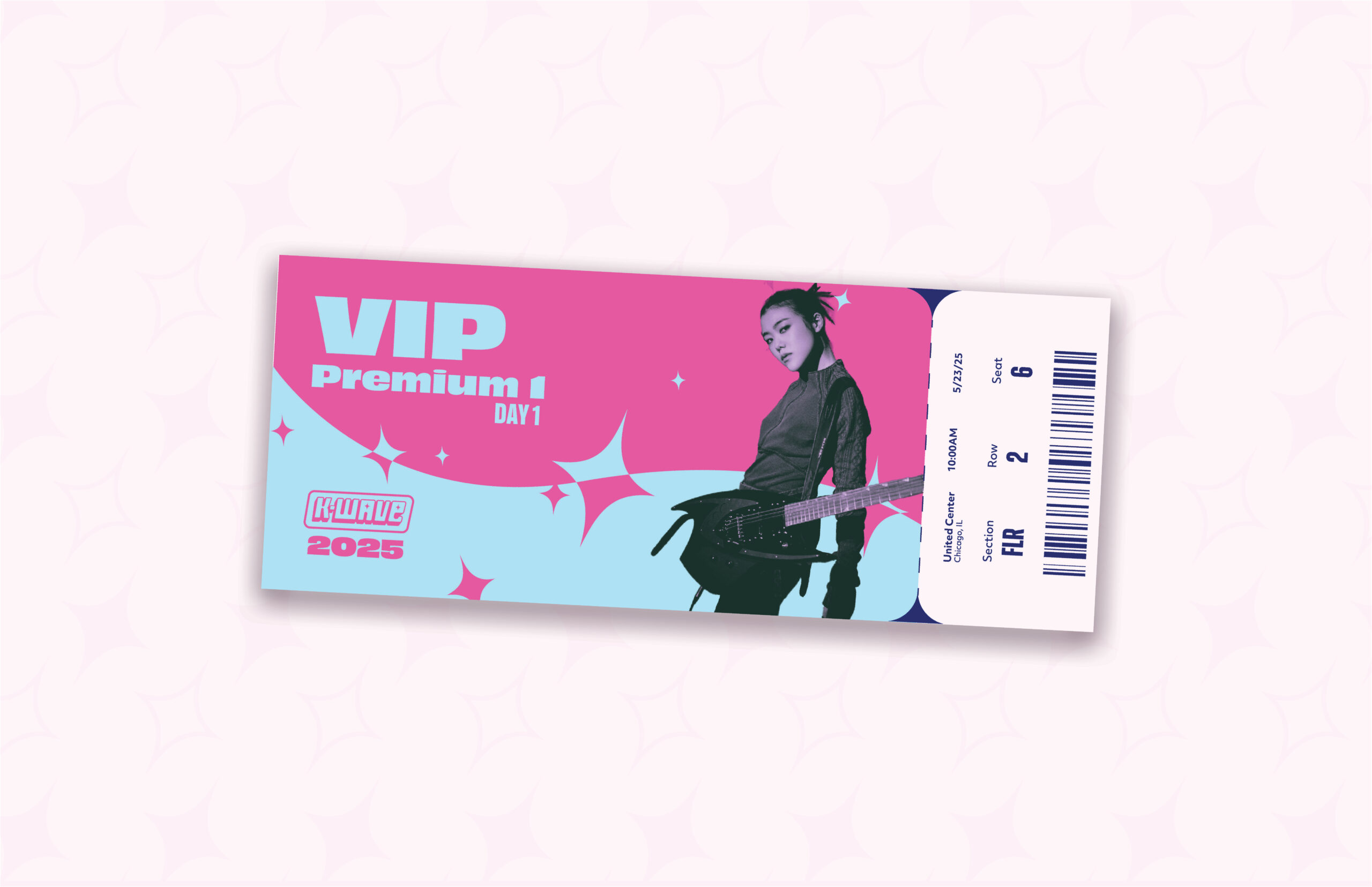
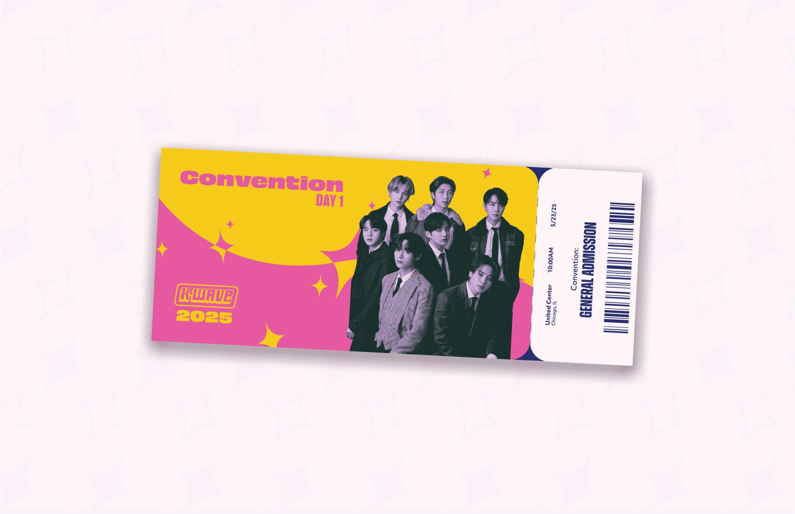
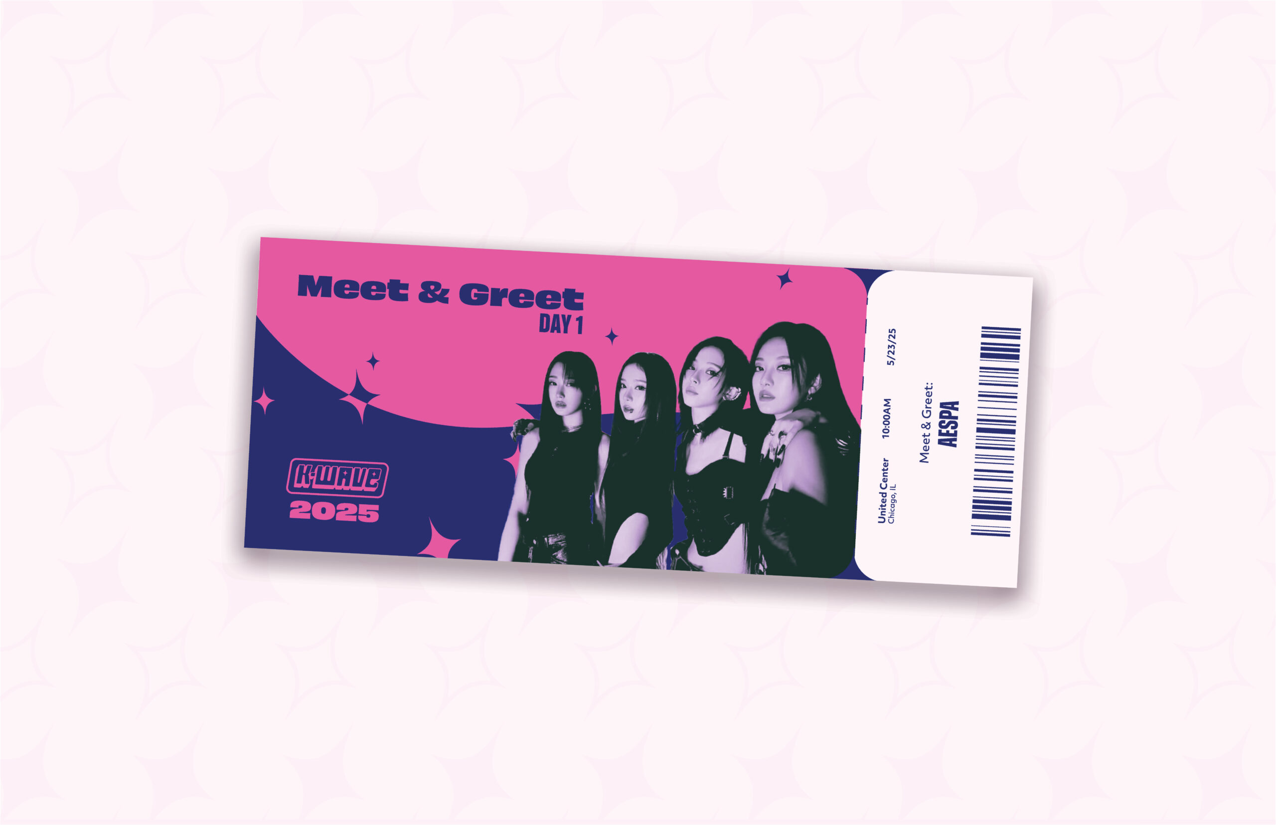
Tickets
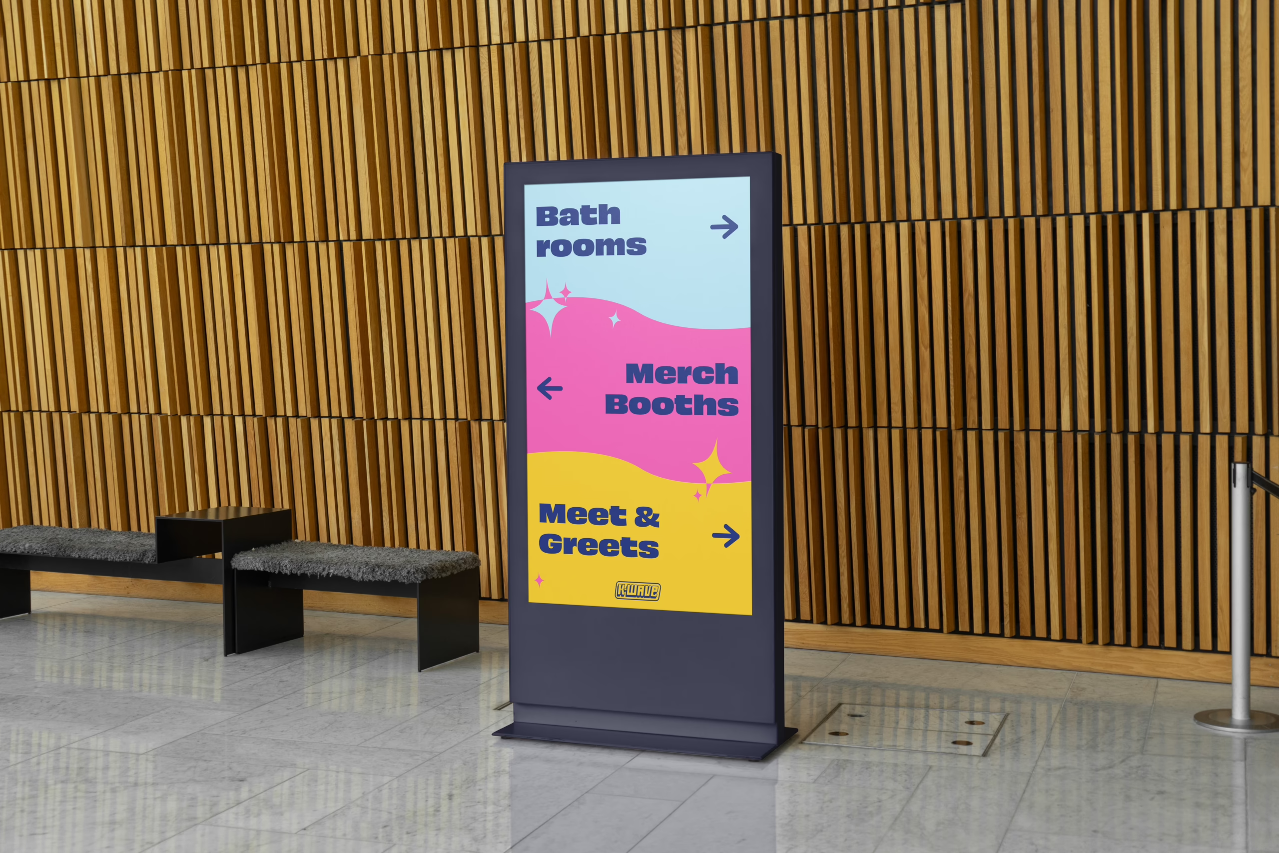
Wayfinding Sign
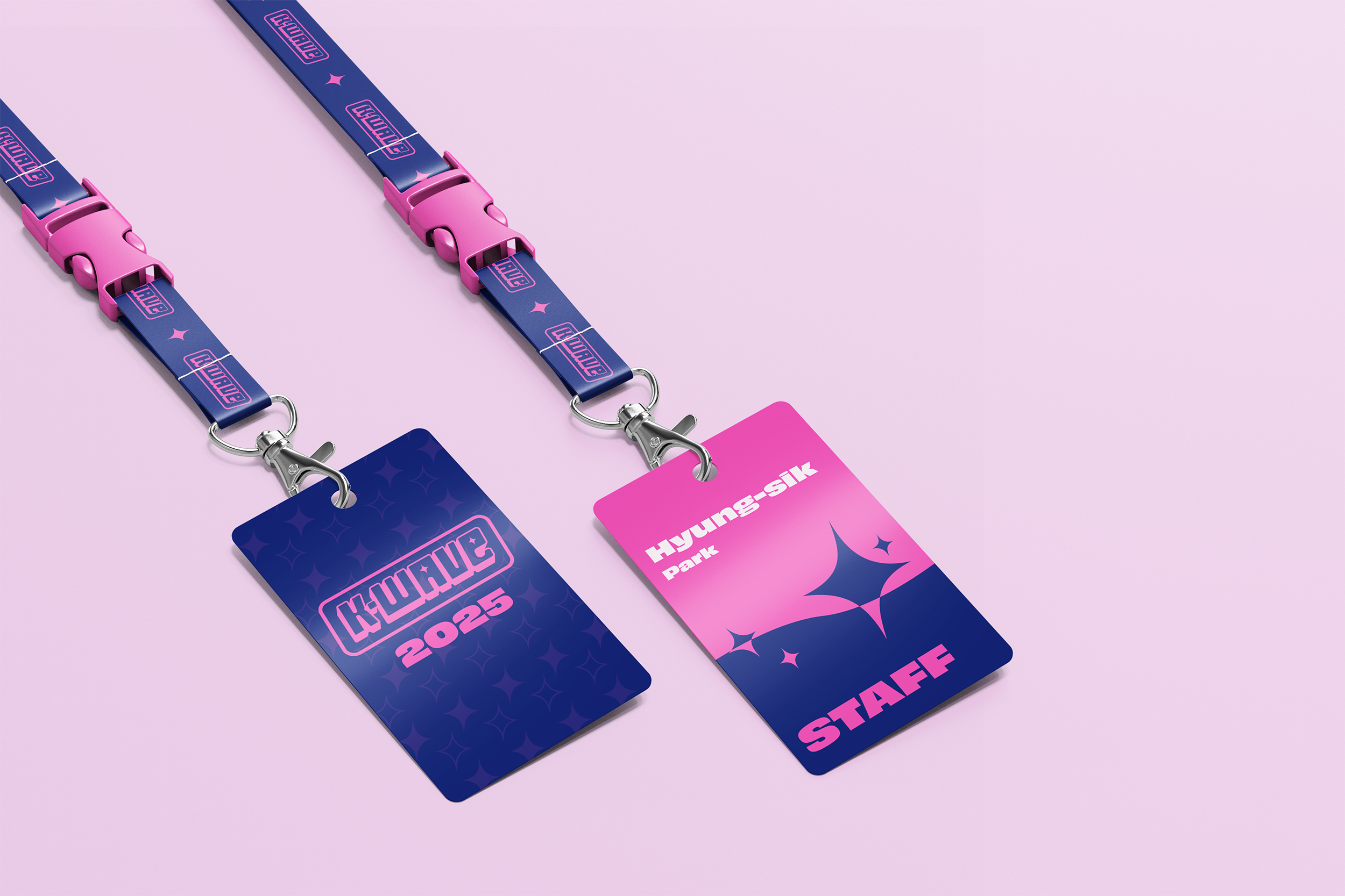
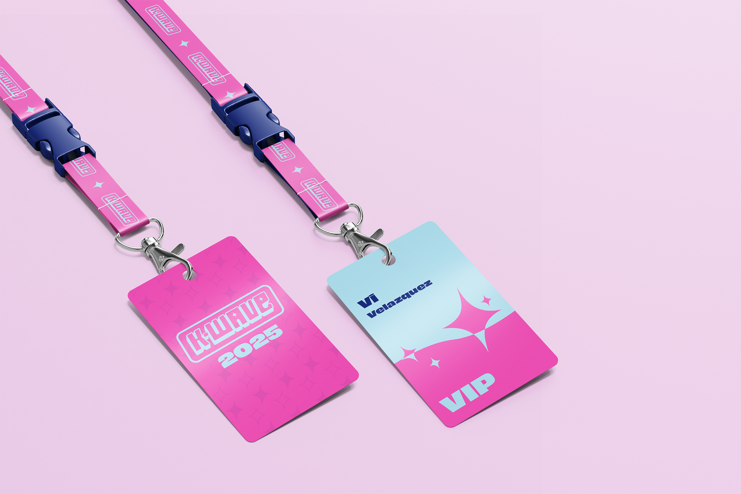
Lanyards
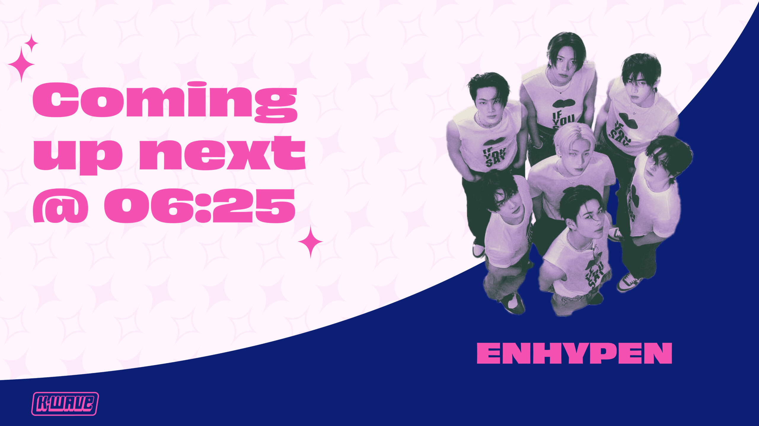
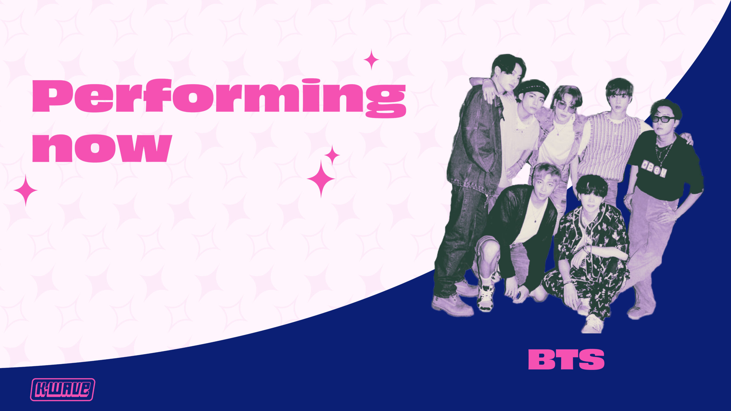
Slide Deck
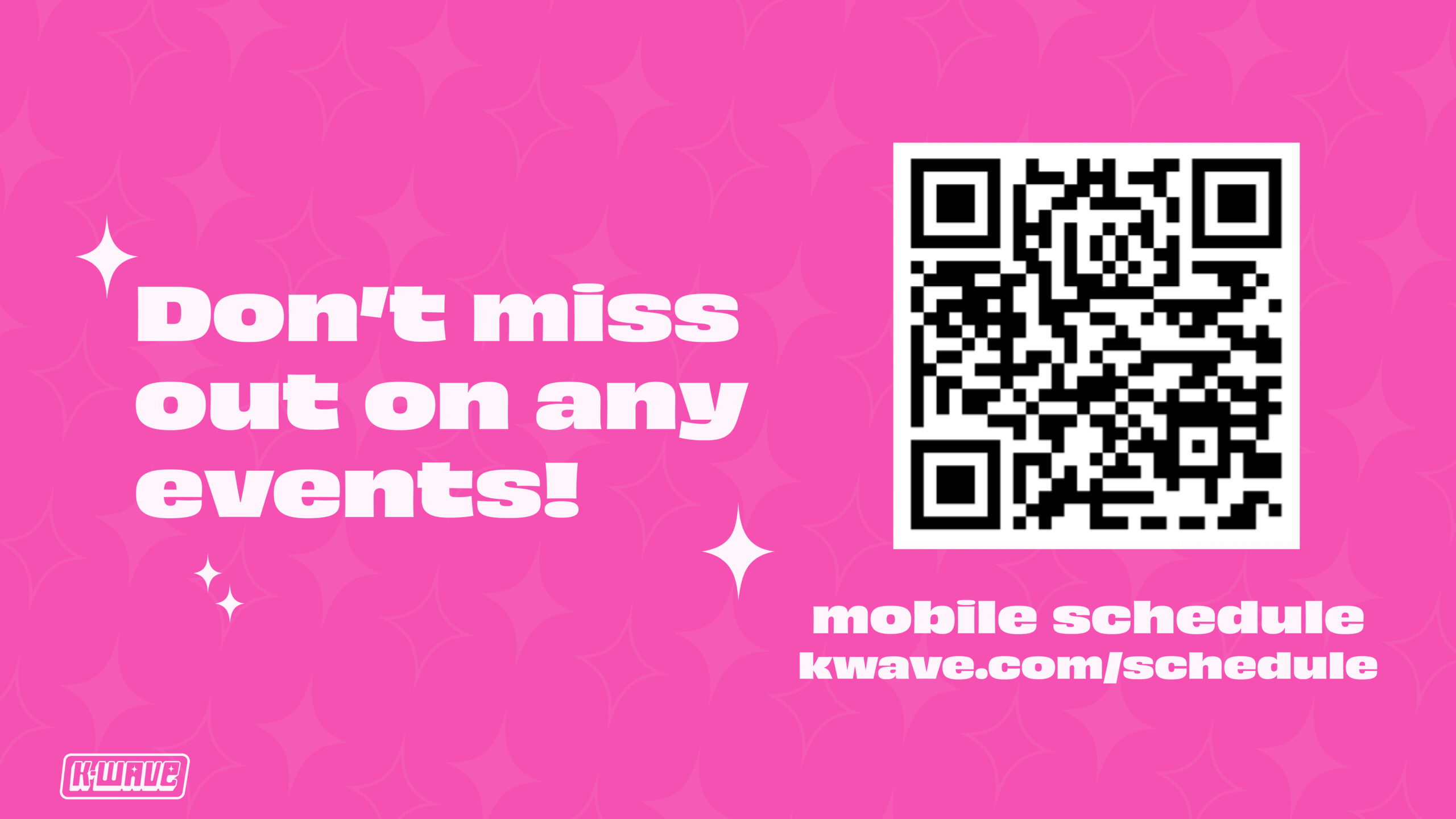
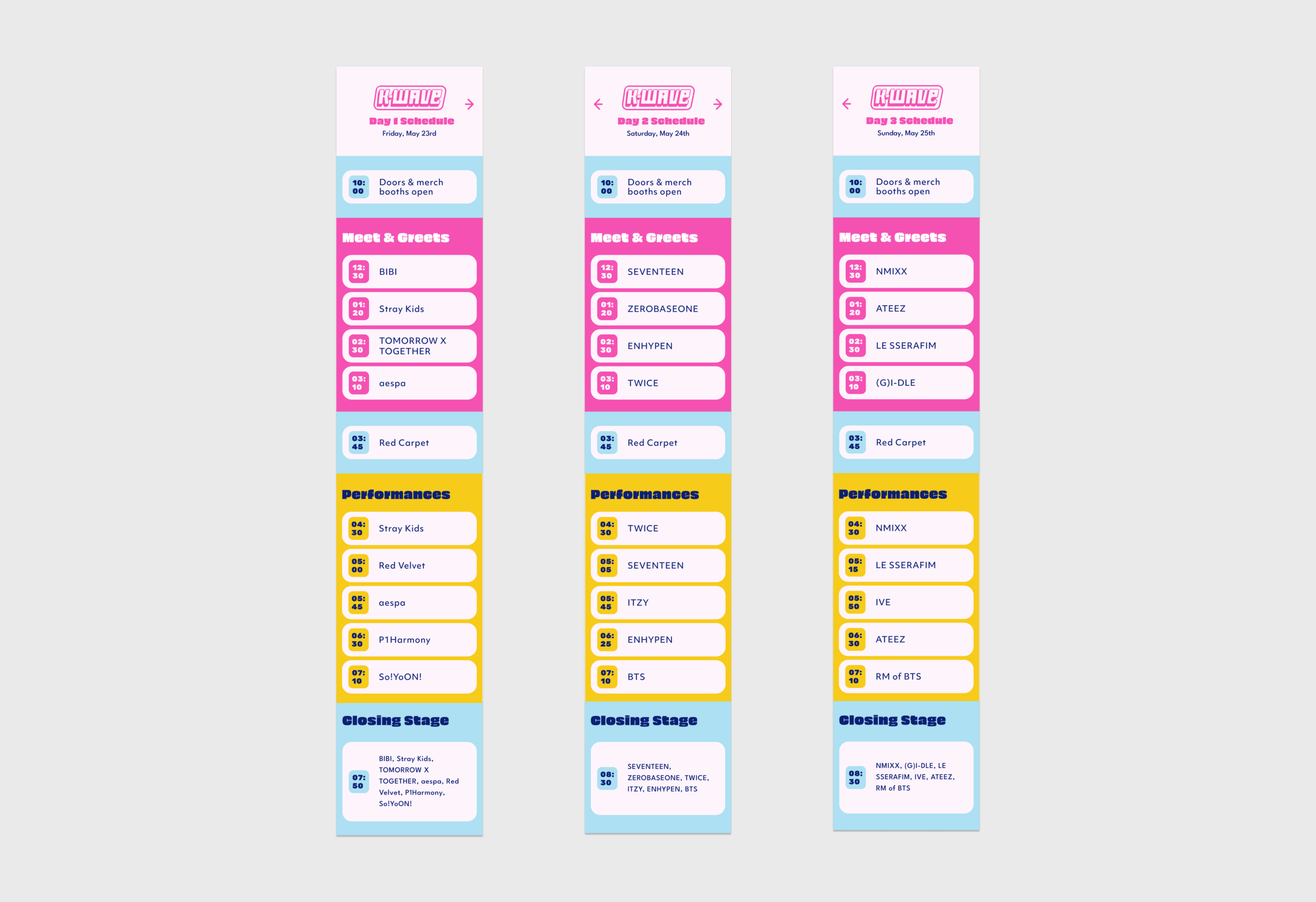
Mobile Schedule
Merchandise