Overview
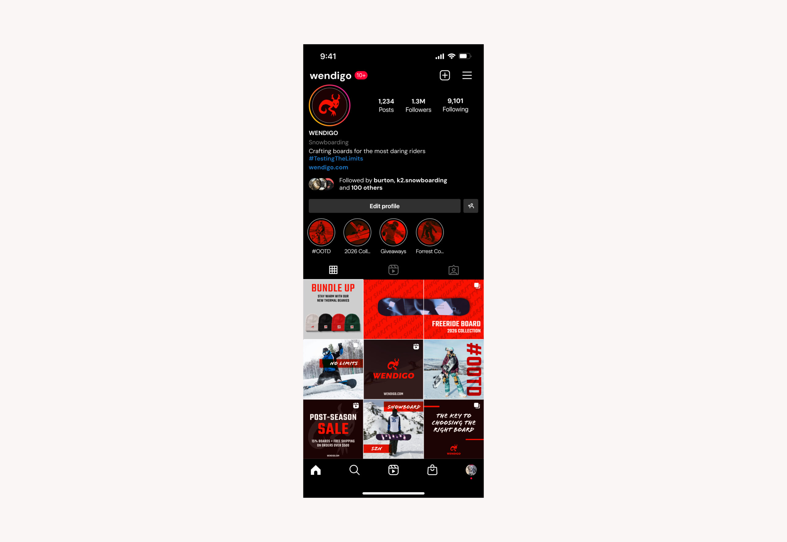
Wendigo is a newly established snowboarding company that creates snowboards. Their main audience are boarders who aren’t afraid to be risky on the slopes and are looking for the board that suits them in terms of both skill and style. Wendigo values maximizing style and creating durable boards that shows who each unique boarder is. Their main goal for this campaign is to set the stage for the seasons to come and show their style in various aspects of their brand.
Justifications
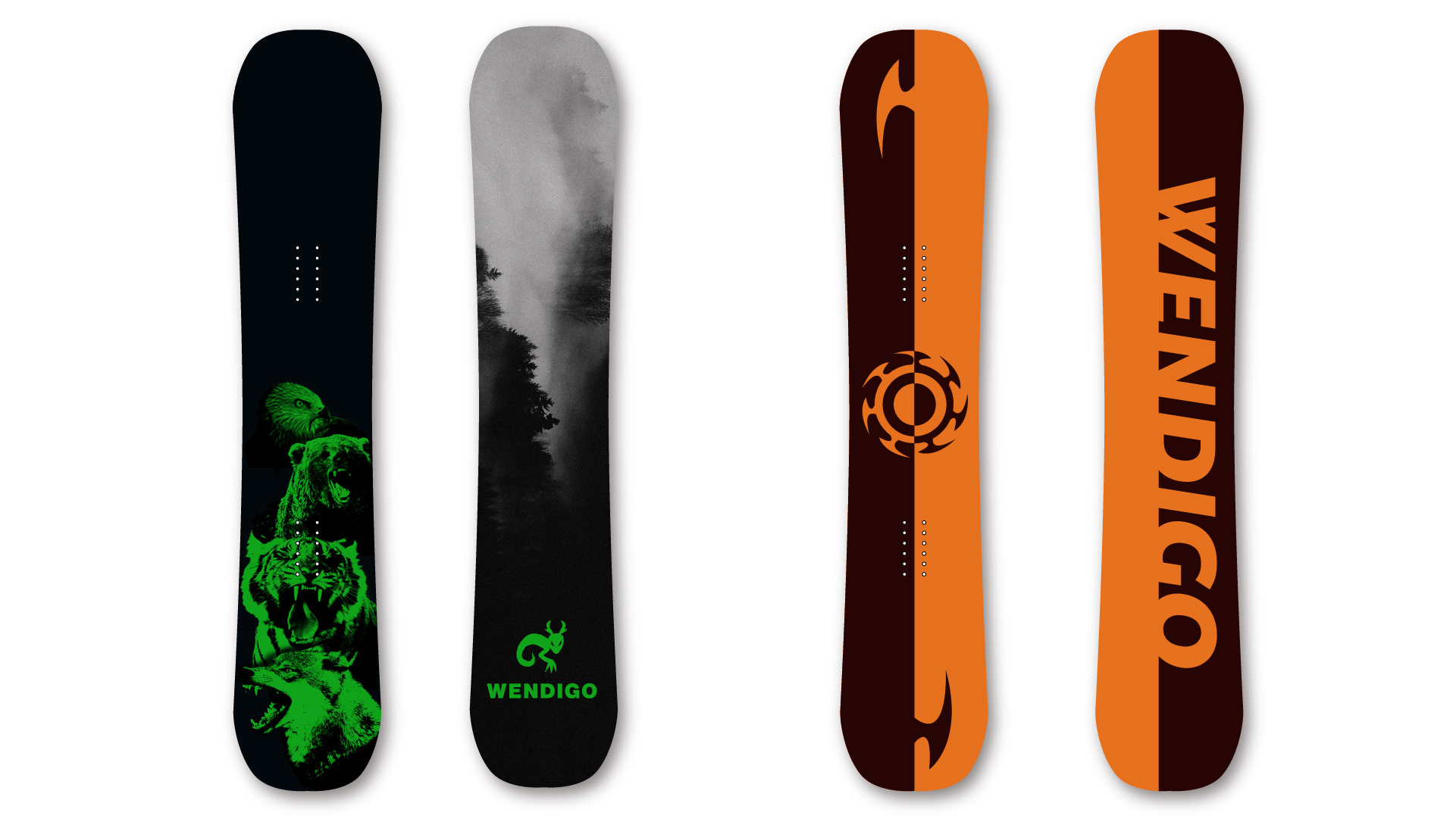
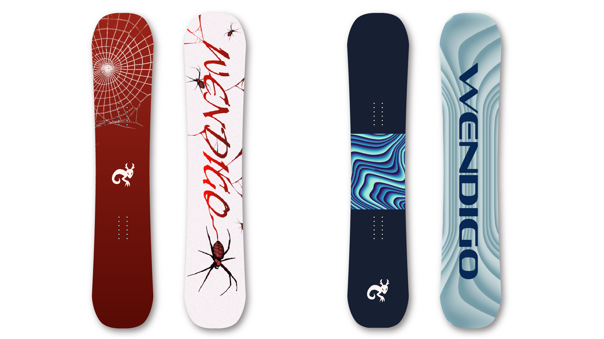
The feel of this brand is to be daring, bold and edgy, while still keeping a sleek style. When looking at any part of the branding, it is clear that those who buy Wendigo’s products are adventurous and embrace their fearless side. For Wendigo, I went for a controlled chaos feeling. The goal was to make it feel outdoorsy and this is mostly shown in the layering and the type. I used lots of layering to bring in more depth and used a scratchy typeface that feels more hand drawn. To give it a bold feeling, I went with a bright red and used red overlays for images that ties the whole brand together.
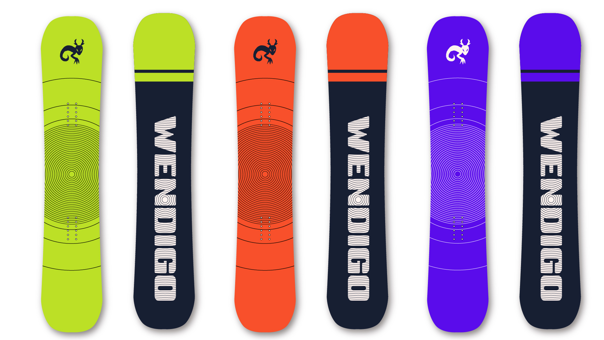
Boards

Look Book
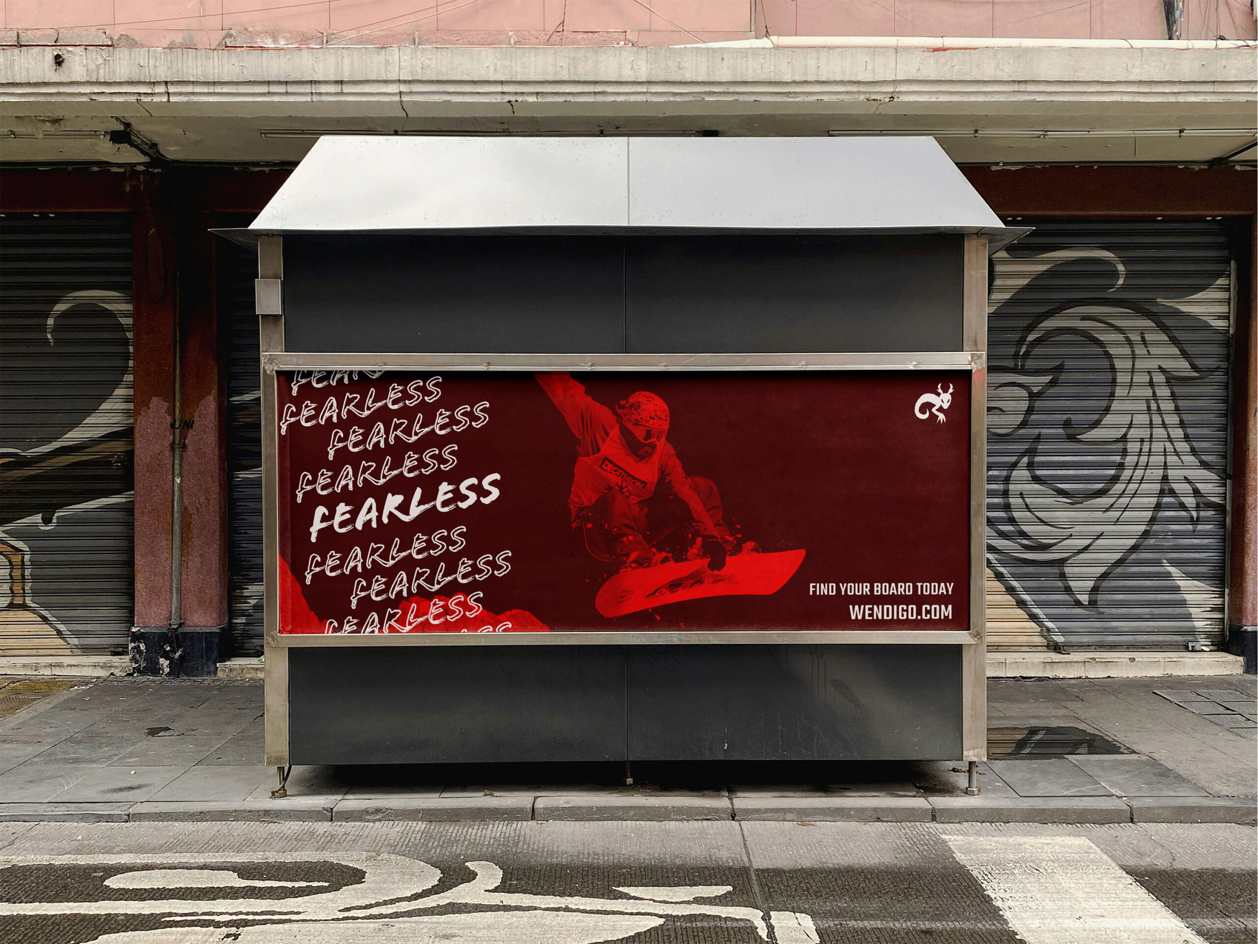
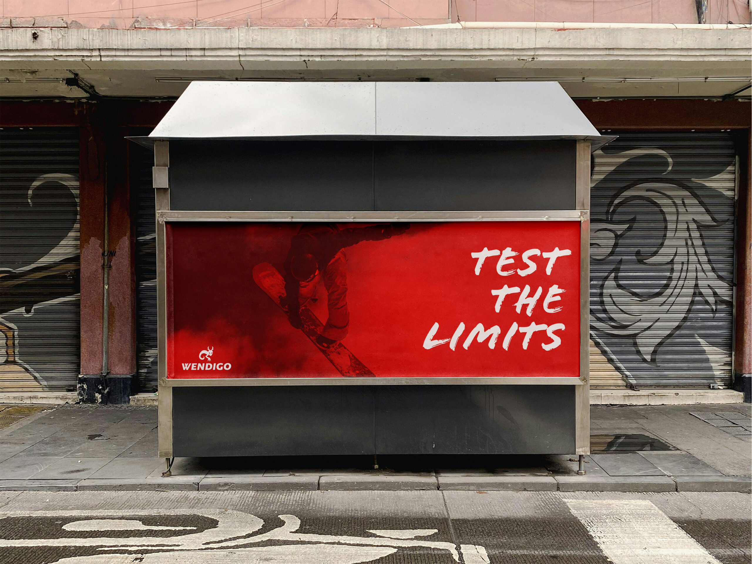
Environmental Signs
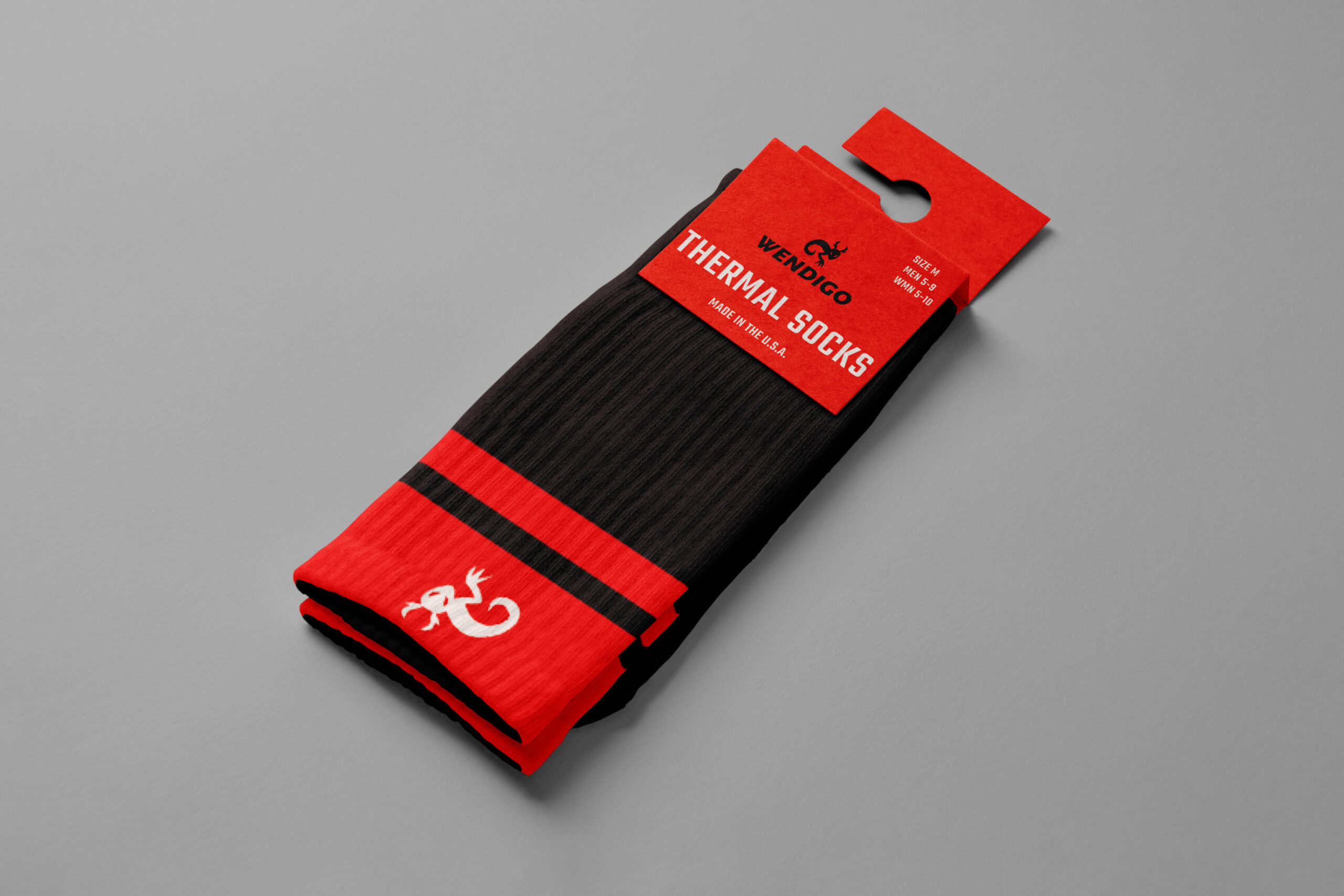
Socks
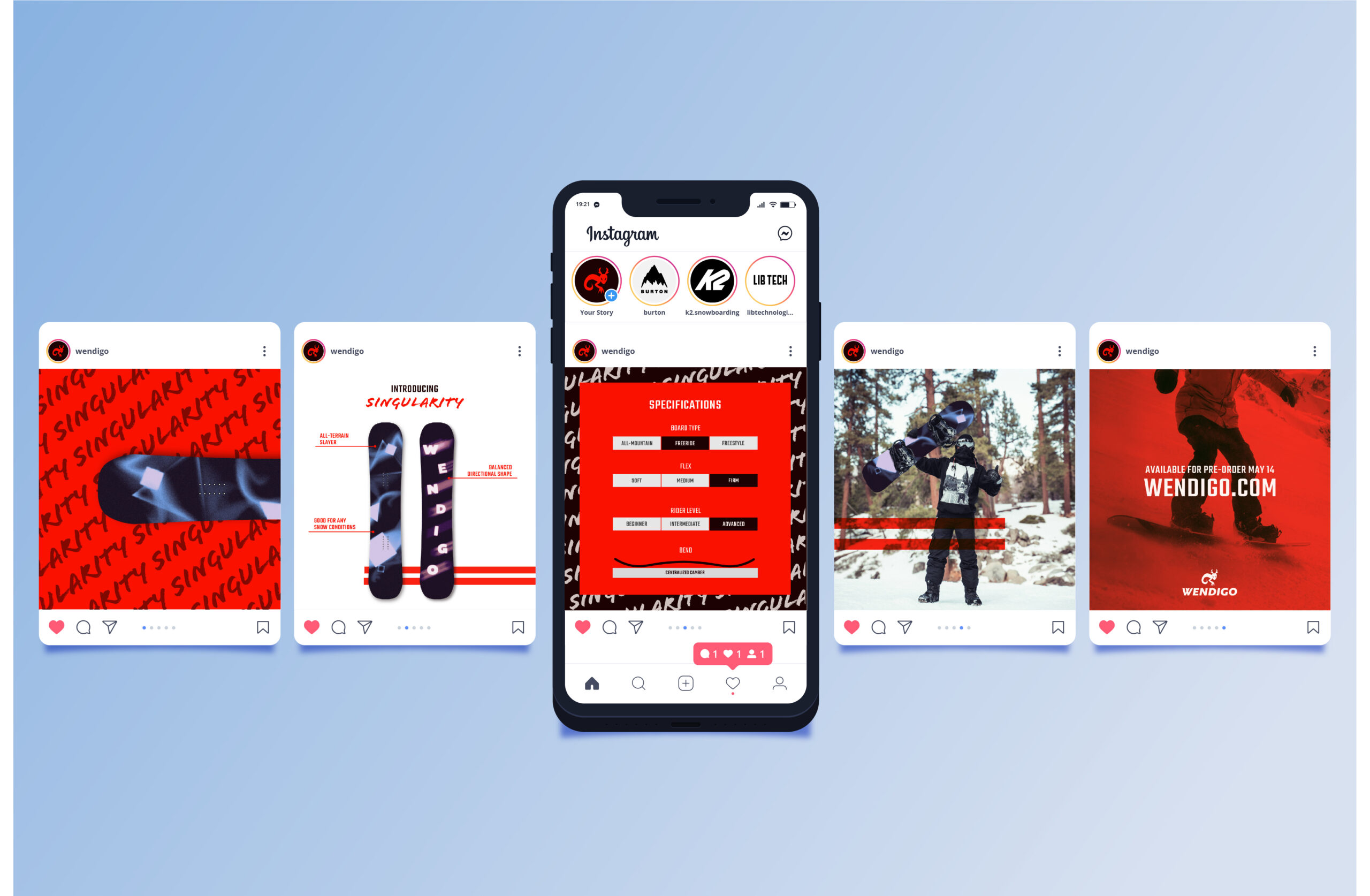
Instagram Page
Instagram Post